This work is part of the User Feedback Project for the Covid-19 Mobility Data Network, which has been generously supported by the Institute for Global Health at Northwestern University.
Syracuse is a modest sized city of just over 140,000 people in upstate New York. It sits within the heart of the Finger Lakes region, not far from Lake Ontario. Although far from the worst hit areas of New York state by COVID-19, Syracuse saw alarming increases in cases and deaths during the initial wave of the pandemic. Daily cases in Onondaga County, where Syracuse is located, hit their daily peak of 145 on the 19th of May, with nearly 5,000 total cases and over 200 deaths recorded as of October 13th, 2020.
The city of Syracuse, like many others around the United States, sought to use digital mobility data as part of their means to implement, monitor and adjust physical distancing policies in order to mitigate the spread of COVID-19. A small data team within the city government took it upon themselves, with support from the COVID-19 Mobility Data Network, to learn how to analyze digital mobility data in order to inform public health decision-making, and in the process made significant advances in data applications for the control of COVID-19 in their area.
The use of mobility data by the city of Syracuse from March through June, 2020, is an example of a multi-member collaboration between Harvard researchers in the COVID-19 Mobility Data Network and a city-level data team, which was tasked with responsibilities in public health analysis despite not itself sitting within the department of health.
Facebook mobility data was integrated into broader situational awareness efforts including an interactive dashboard that was made available to the mayor and others. Different users and decision-makers viewed mobility data trends after social distancing measures during phases of reopening, holidays, and spring temperature changes.
“I think it’s (mobility data) pushing the decision makers to think about things in ways that we haven’t thought about before”
– Neha Majety
The all-women data team, Amanda Darcangelo, Neha Majety, Joanna Bailey, and Jennifer Glass worked closely with Nishant Kishore, a PhD student affiliated with the Center for Communicable Disease Dynamics at Harvard University.
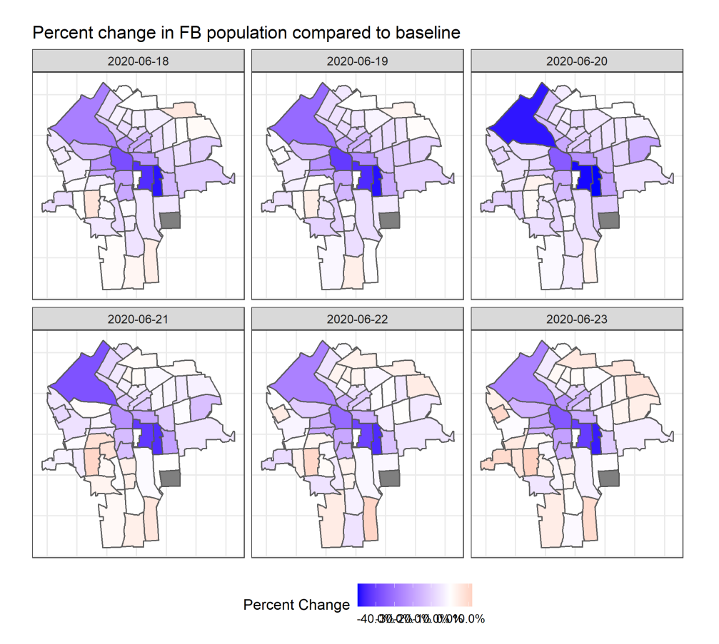
The Syracuse team learned about the COVID-19 Mobility Data Network and The map series demonstrates the percentage change in population of Facebook users within the census tracts of Syracuse. Facebook mobility data through their chief data officer as well as a group call with other cities in the United States. Virtual conversations followed between Nishant and the team, where they discussed both the potential added value of mobility data and its limitations for COVID-19 response activities. The data team was working to support the mayor’s interests in seeing how people were responding to the executive orders to stay at home.
Our mayor is very adamant about us making data driven decisions as a government as a whole. And being able to remind him that there are different obscure ways of addressing that data and supporting our populations, (is important).
– Amanda Darcangelo
After two calls, the team decided to use Facebook population data given the delayed baseline period and subsequent lack of movement data. Nishant created a template showing population changes as a proxy for movement at the census tract level, as well as population changes during different times of day. The situation reports were shared in PDF format and frequently reviewed by the data team and chief data officer. Joanna Bailey, the data team’s GIS expert, soon had access to geographic shapefiles, enabling them to adapt and determine how best to use the data to fit their needs.
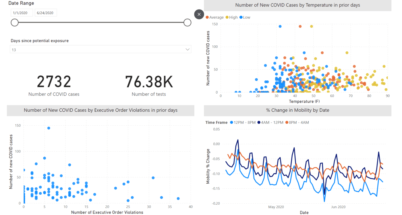
The Syracuse team integrated the Facebook data into a broader situational awareness dashboard for the county. They were interested in visualizing the trends in case data in relation to spikes in mobility. The purpose of the dashboard was to correlate spikes in mobility to weather pattern trends.
At the team’s request, Joanna Bailey received comma-separated-values (CSV) files of anonymized aggregated data so they could continue to monitor changes and analyze the data in combination with other data including temperature, COVID-19 symptom emergency call locations, and the number of COVID-19 cases and tests. During Easter weekend they anticipated that there would be increased movement during that time due to family gatherings and warmer weather.
Their analysis confirmed that there was a spike in movement during the holiday weekend. The structured data files enabled Joanna and Jennifer Glass, the data intern, to create maps that the team believed provided an easier way for them to monitor changes and work with other datasets to see potential relationships between movement near business areas during reopening phases as a potential proxy for rates of economic recovery.
Envisioning Use Cases and Collaborations
Like many other collaborative teams in the mobility network, groups working within government agencies envisioned that the mobility data would help them better understand the impact of social distancing policies during the early phases of the pandemic. What many groups learned over time was that iterations and adaptations with the mobility data were crucial in aligning it with their specific needs.
“I also feel like this is kind of giving us the opportunity to look deeper into the different parameters that govern the society… You know, it kind of pushes us into more diverse tracks of thought. So I think it’s helping us in a lot of ways.”
– Neha Majety
More often than not, defining those needs with an often unfamiliar data source takes time – a journey of learning between all groups involved. The Syracuse collaboration “kicked off” in the first week of April with PDF situation reports, and evolved over time to maps created internally by the Syracuse data team and eventually an online dashboard. Using the Facebook population data as a proxy for movement data helped the data team in Syracuse support the broader needs of the government during the response to COVID-19.
“It’s definitely made our leadership reassess what using data means… [for example] here are some people who are mobile, and here are tracks in which we may have more mobile people but we don’t know because they don’t have internet.”
– Amanda Darcangelo
While some of the outcomes included an evolution of maps, data products, and insights over time, the use of Facebook data had meaningful influence on how the data team envisioned the role of data generally in the crisis, including perceptions of how it can play a meaningful role in the ongoing digital transformation within their organization.
ACKNOWLEDGEMENTS
This case study was written with support from Lauren Bateman and Kate Bruni